


Kudu Workplace Wellbeing
is an ever-evolving business, goal-driven
to help improve lives.
Kudu are highly spiritual and offer guidance whenever we are feeling low or when a block in spirituality is around us. They provide strength and because they are prey to so many of Africa’s greats they offer energy and power to those who feel it may be evading them. In a time of distress, job losses, pay cuts, and, diminishing opportunities.
Kudu wants to promote the well-being of people in businesses to bring new hope in an ever-changing world. Supporting businesses to create a positive culture through tailored solutions to adopt into a business.
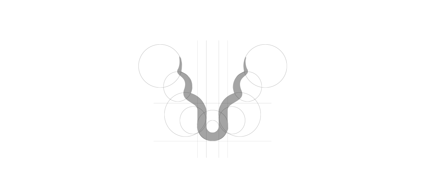
The Logo
Creating a traditional spiritual concept combined with a modern feel to give this logo a unique and memorable quality all began with the icon. Joining paths from the U in KUDU with the horns of a kudu creates a sense of power, strength, and spirituality. The contrast of the straight lined font represents a business with the curled horns which represent the ever-changing needs of wellbeing.
Brand Colours
Complimentary Colour Palette, with a mixture of deep
darker tones to contrast the bright and vibrant tones.
If you like this style of work please like, and reach out.


